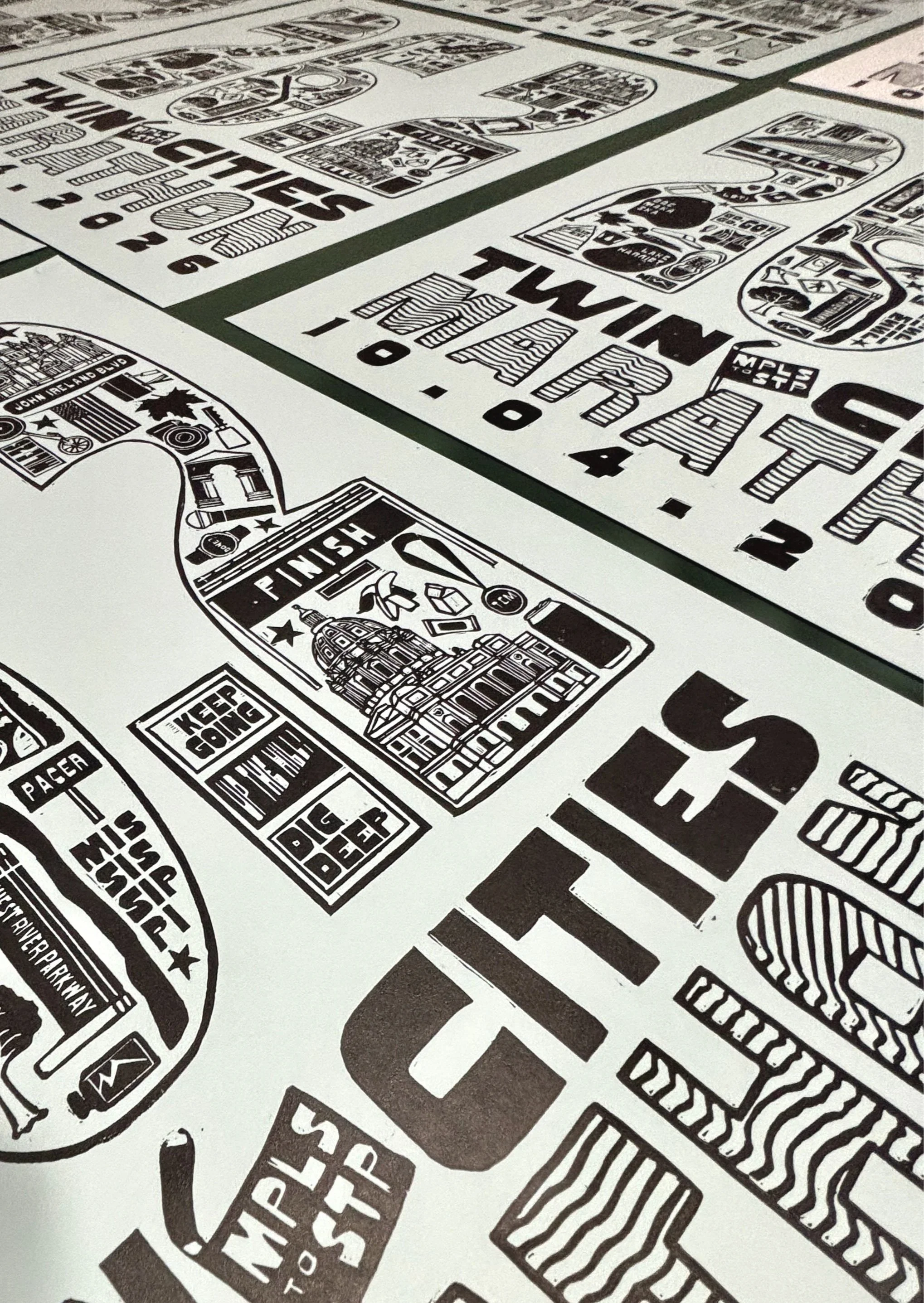
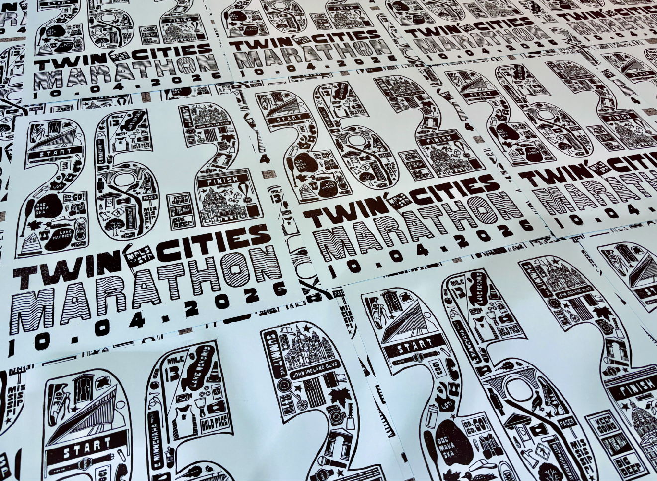
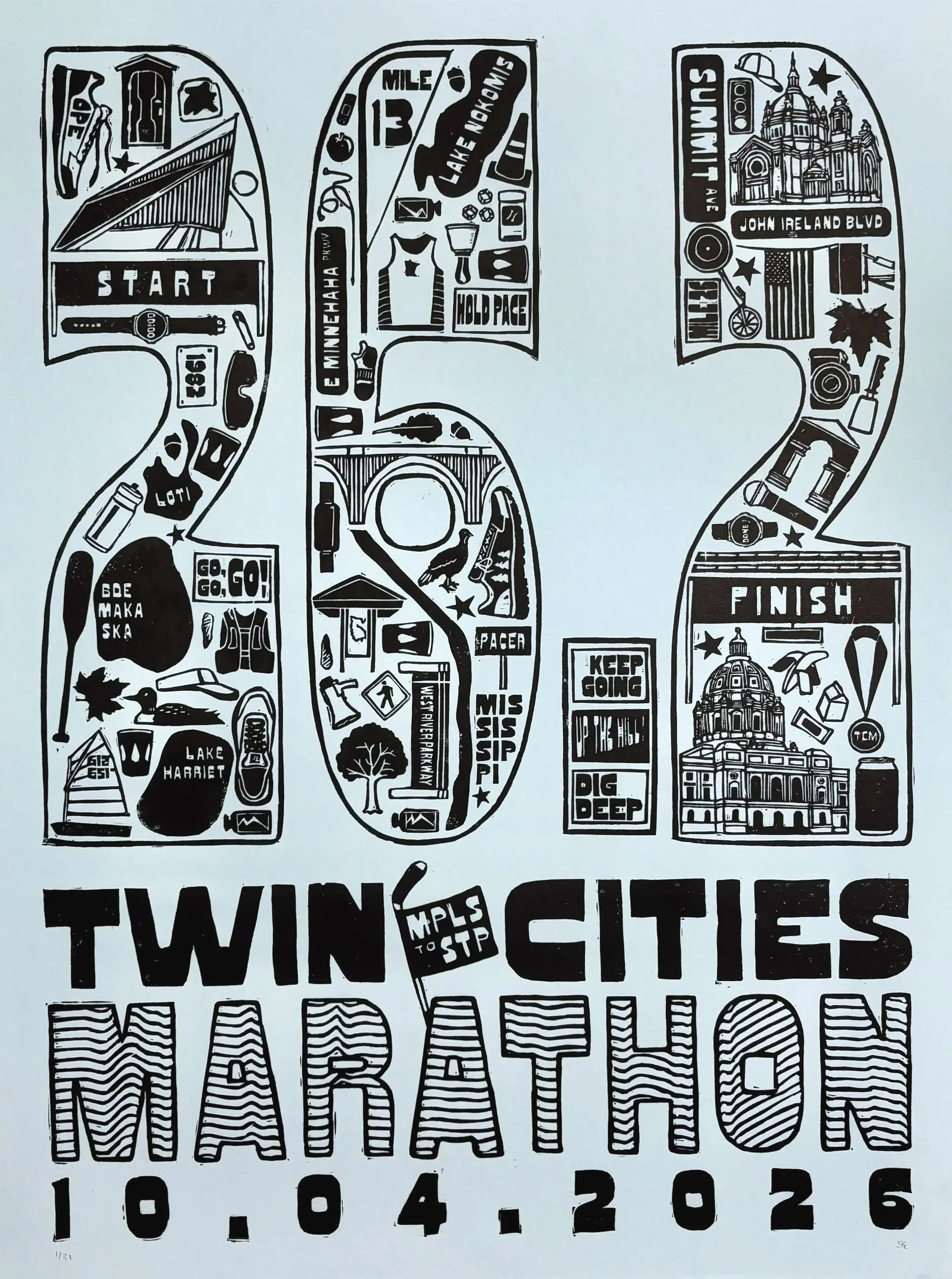
Celebrating the 2026 TCM race weekend, the poster tells the race’s story through iconography and an imperfect, block-printed style.
Twin Cities Marathon Poster
Organization: Twin Cities in Motion
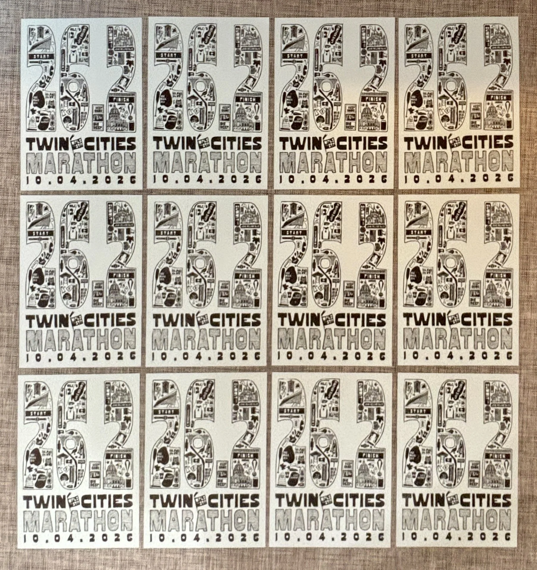
Edition of 31
Block printed in Caligo Safewash Ink on French Paper 60 lb cover
Printed using a homebuilt press and a Jeep Gladiator
Role: Designer
Challenge: Create an original 18 ×24 in. poster celebrating the Twin Cities Marathon that captured the spirit of the race and sense of place.
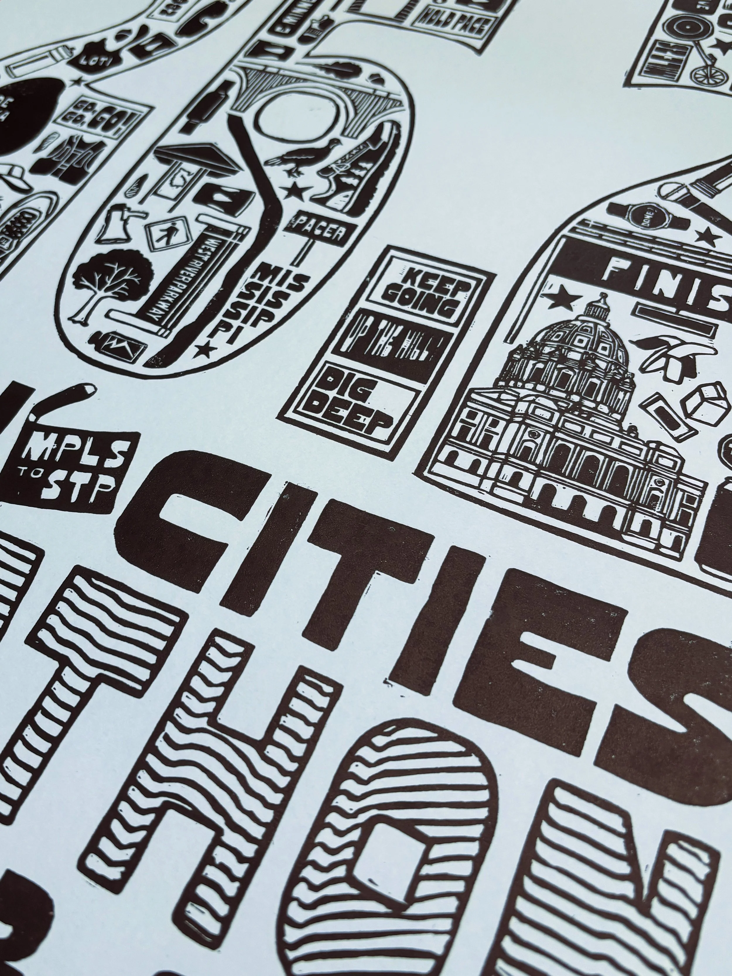
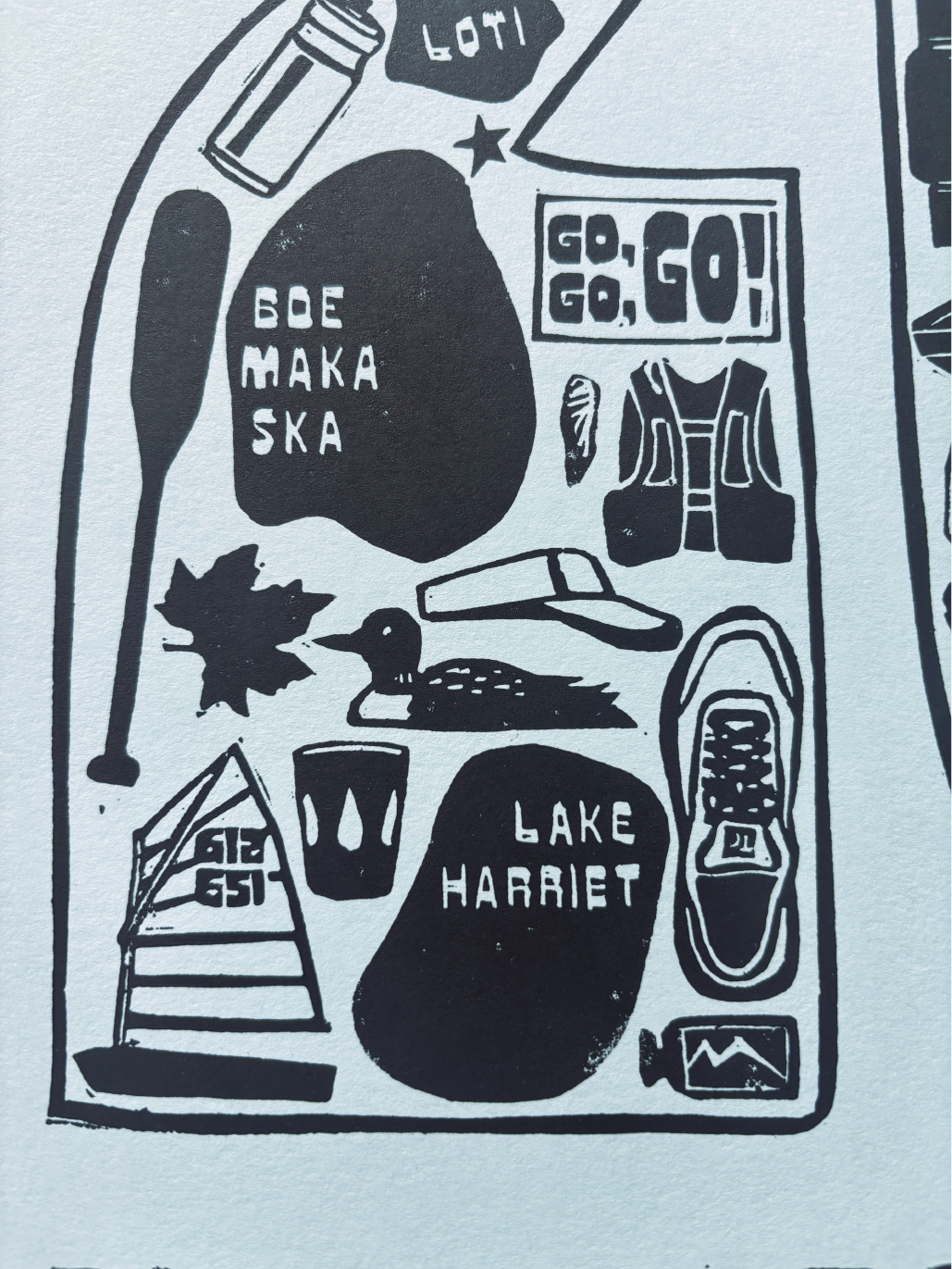
Solution: A hand-carved, hand-printed linocut poster built around “26.2,” incorporating illustrations inspired by the marathon course, Twin Cities landmarks, and the visual language of running.
A little press for the poster
Featured in the Star Tribune
Artists get a running start on creativity | John Rash
I was selected to participate in the 26.2 Poster Show, an annual exhibition featuring original posters created by local artists and designers. With a wide brief, I was able to stretch my legs creatively and combine my graphic design skills with an exploration of larger-scale printmaking.
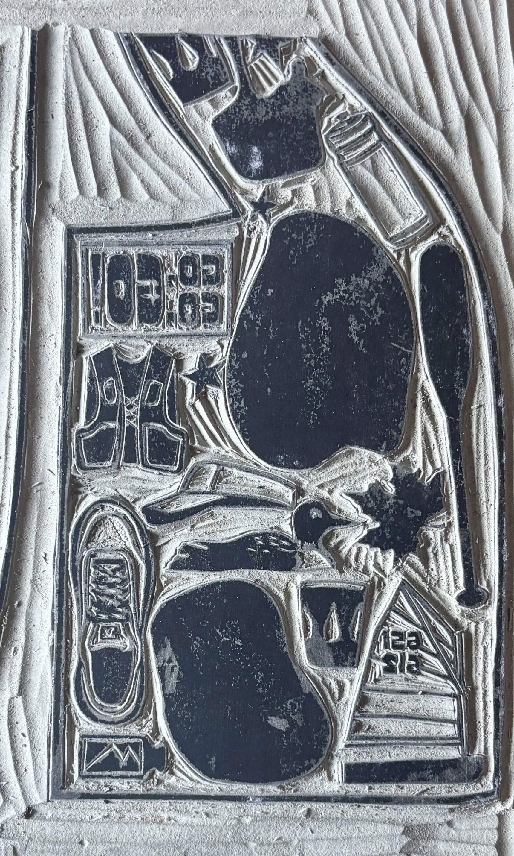
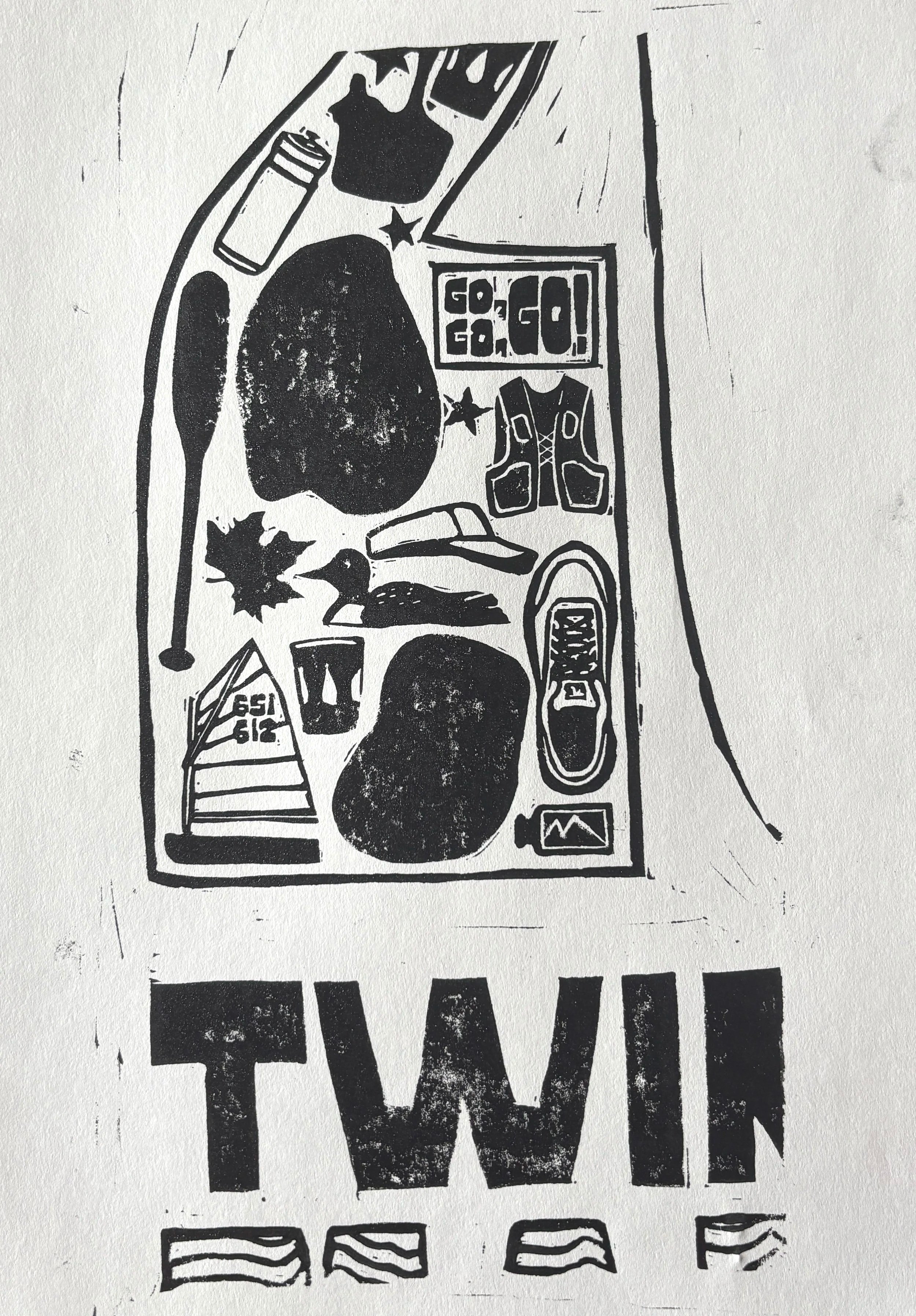
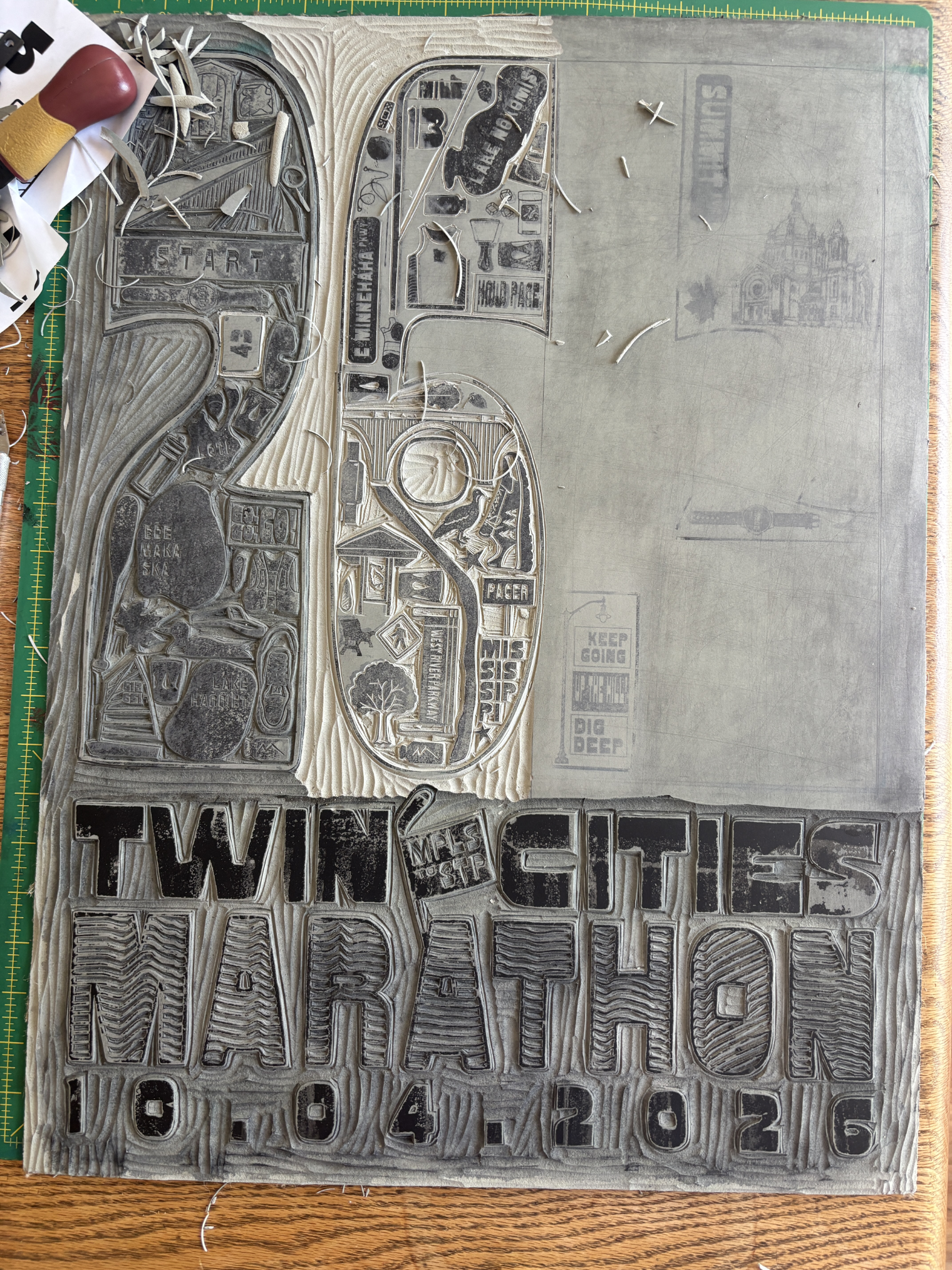
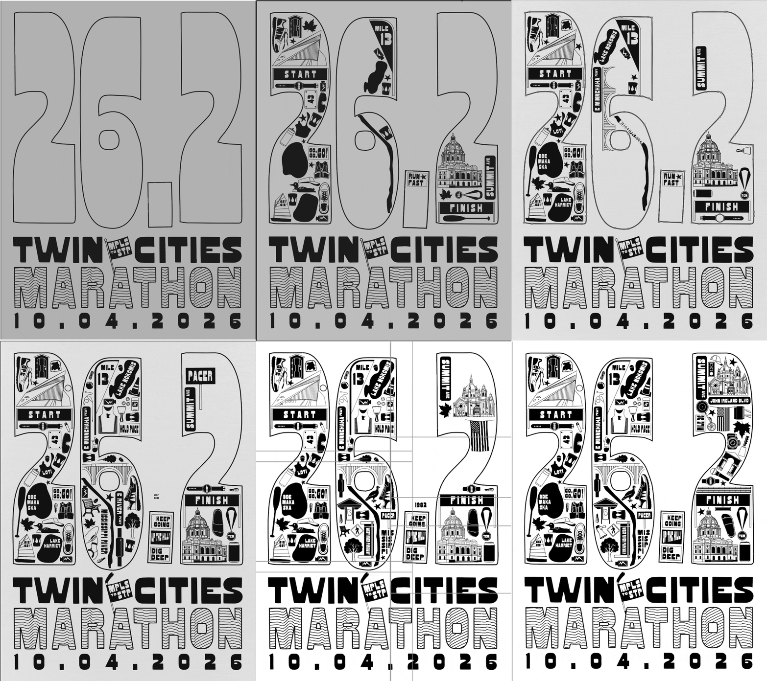
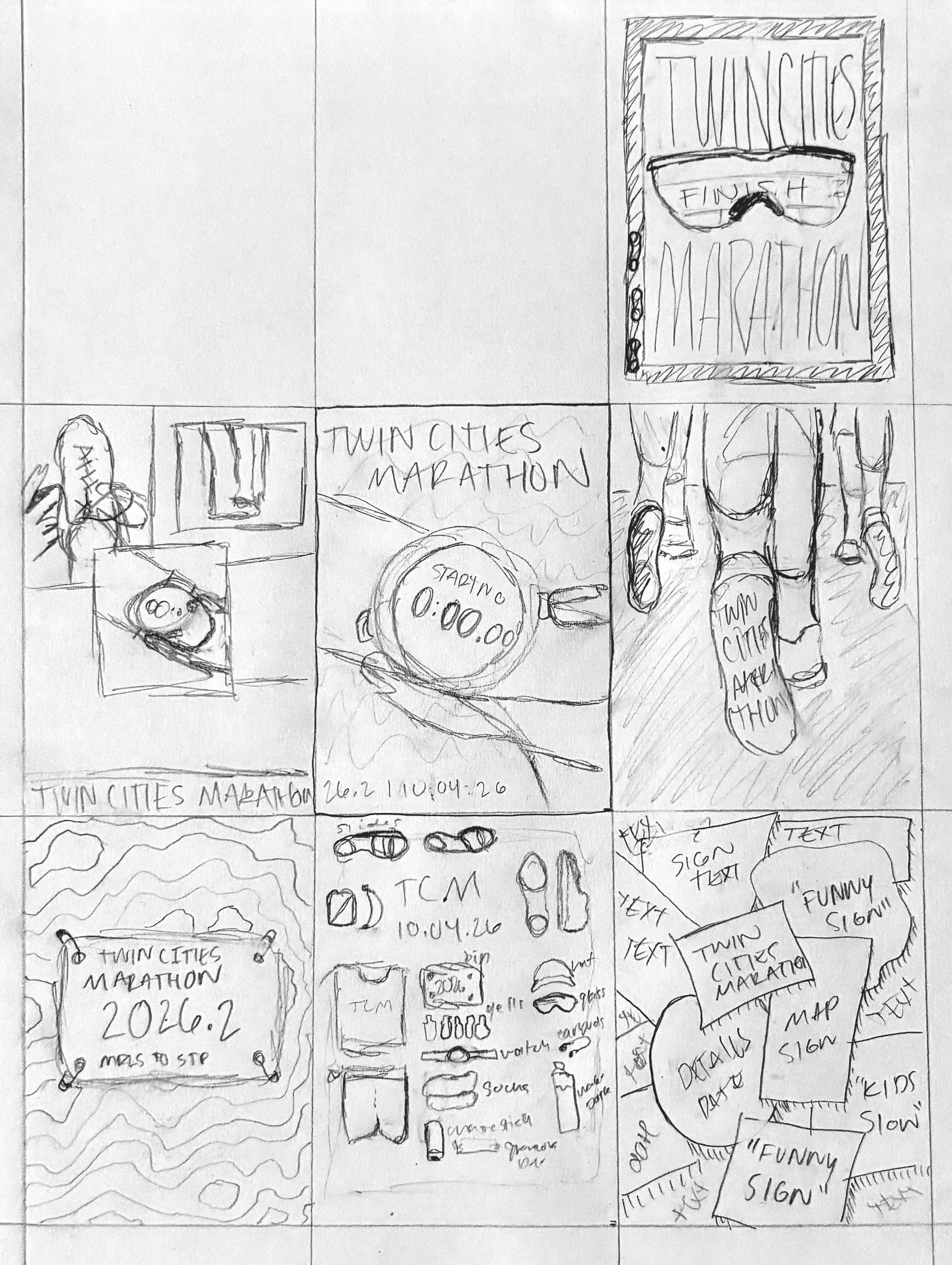
I had lots of iterations early in the process before landing on the approach I wanted to take: telling the story of the race through iconography of things a runner might encounter along the course. The “26.2” is the focal point, with each number filled with illustrations that reference the race, the Twin Cities, and the experience of running it.
During the design process, there were many iterations and tests. Once the design was finalized, I transferred it to a block of linoleum and carved it by hand. The printing process had its own set of challenges, and with the help of my father, we built a press that we could drive over to achieve consistent pressure.
Printing an edition of 31 meant finding a balance between the imperfections of lino printing and the consistency of an edition. Variations in ink coverage, pressure, and texture became part of the final character of the posters rather than something to eliminate entirely.
The Process
Sketching | Digital Design | Testing | Transferring | Carving | Inking | Printing | Drying | Trimming | Editioning | Delivery